
How to use Layouts
From the step view, on the left-hand side, you can reach our Layouts tab. This is where you can change the physical arrangement of the fields, as well as the size of the flow.
At the moment we have two main types of layouts with two more options to choose from.
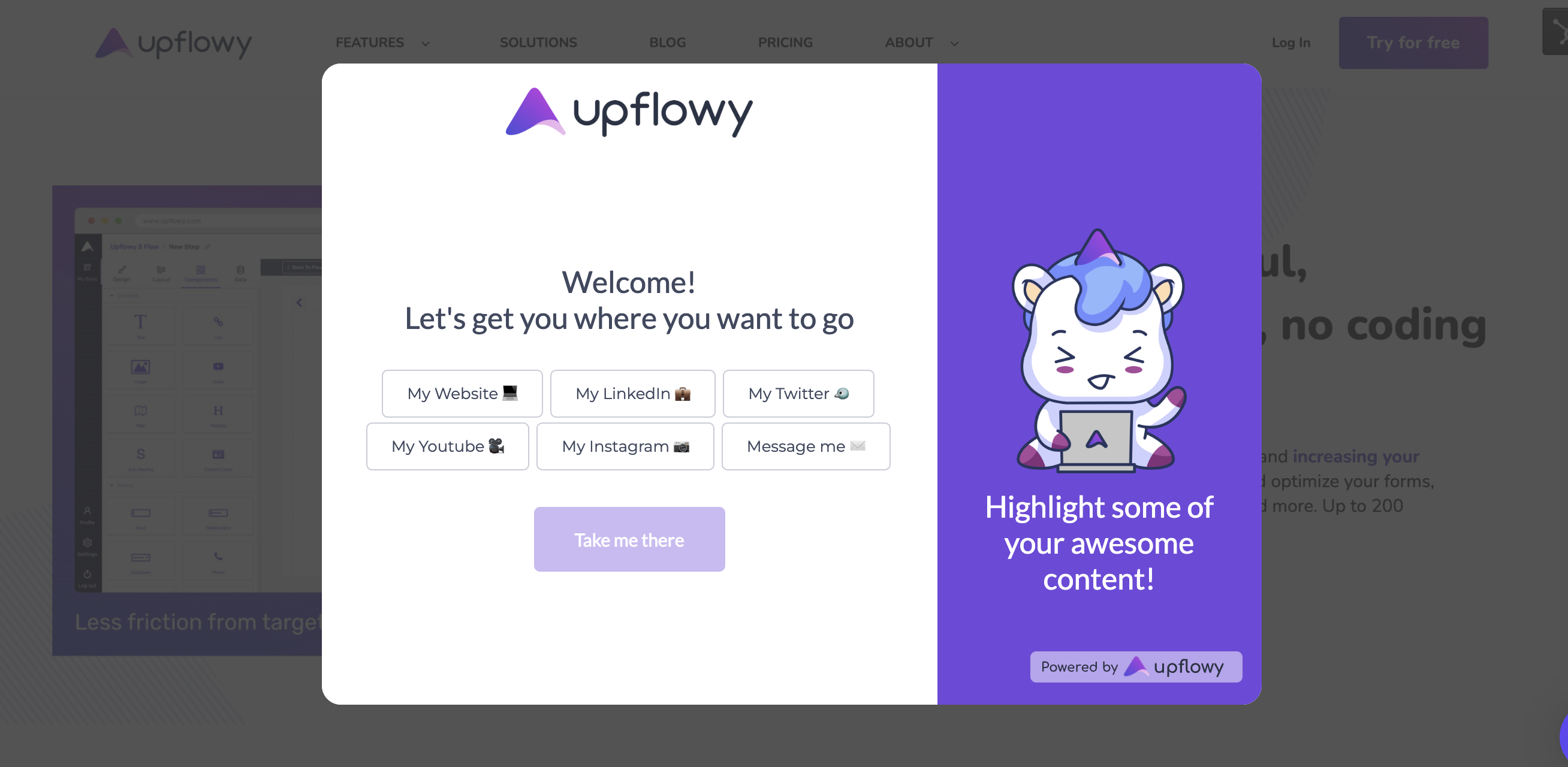
Modal
Modal layouts let you display your flow on top of other content as a pop-up window. It is best used on websites, however, by adding a background image behind the flow, you can use the modal type of flows standalone as well.
Important: modals will open in full-screen in mobile view to retain as much screen real estate as possible.
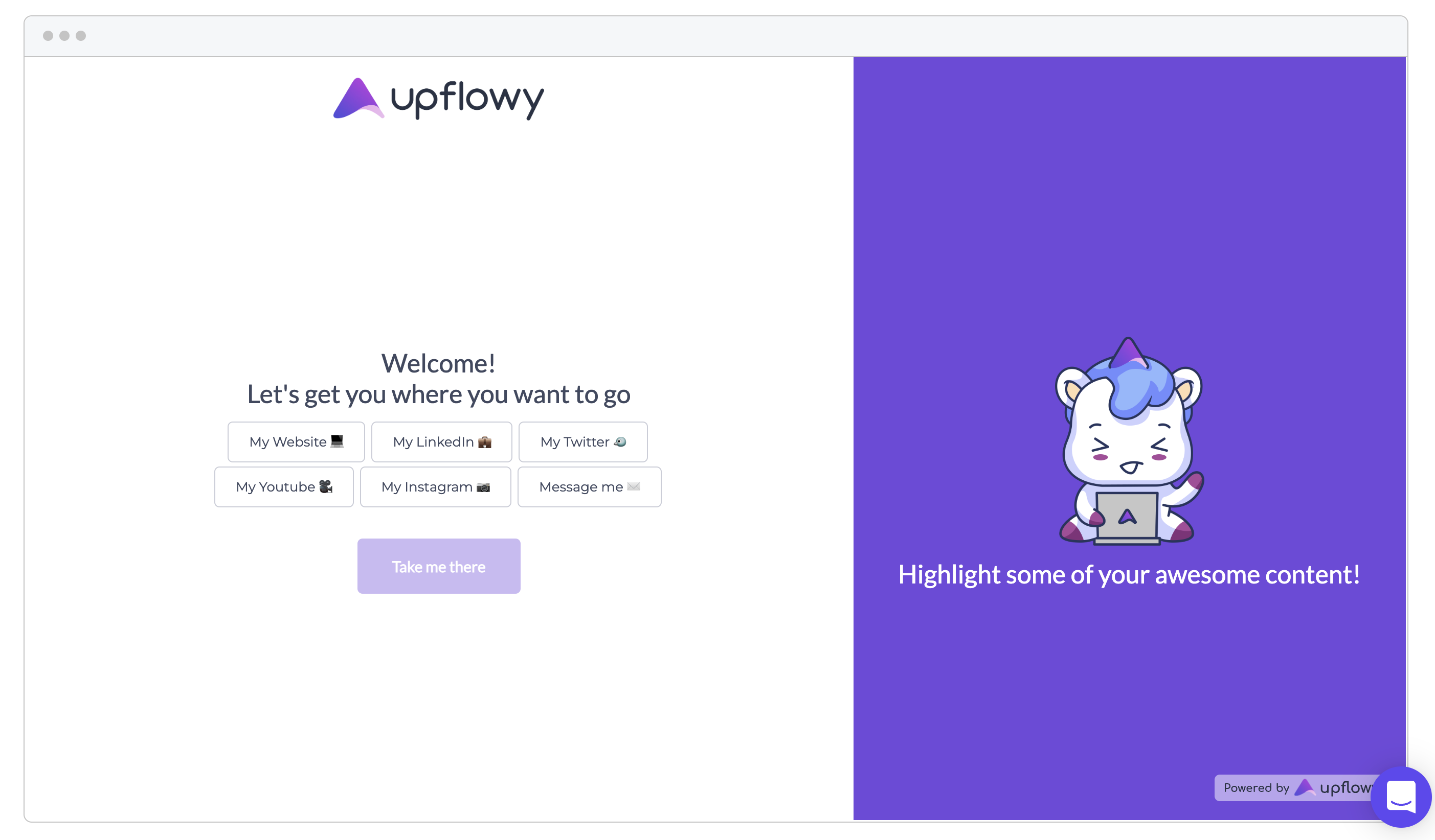
Full Page
Flow layouts in standalone mode will utilize the full screen, in both mobile and desktop views:
If you embed your flow in your website as an iframe, however, you can change it's size dynamically and it will take up the space you provide it.
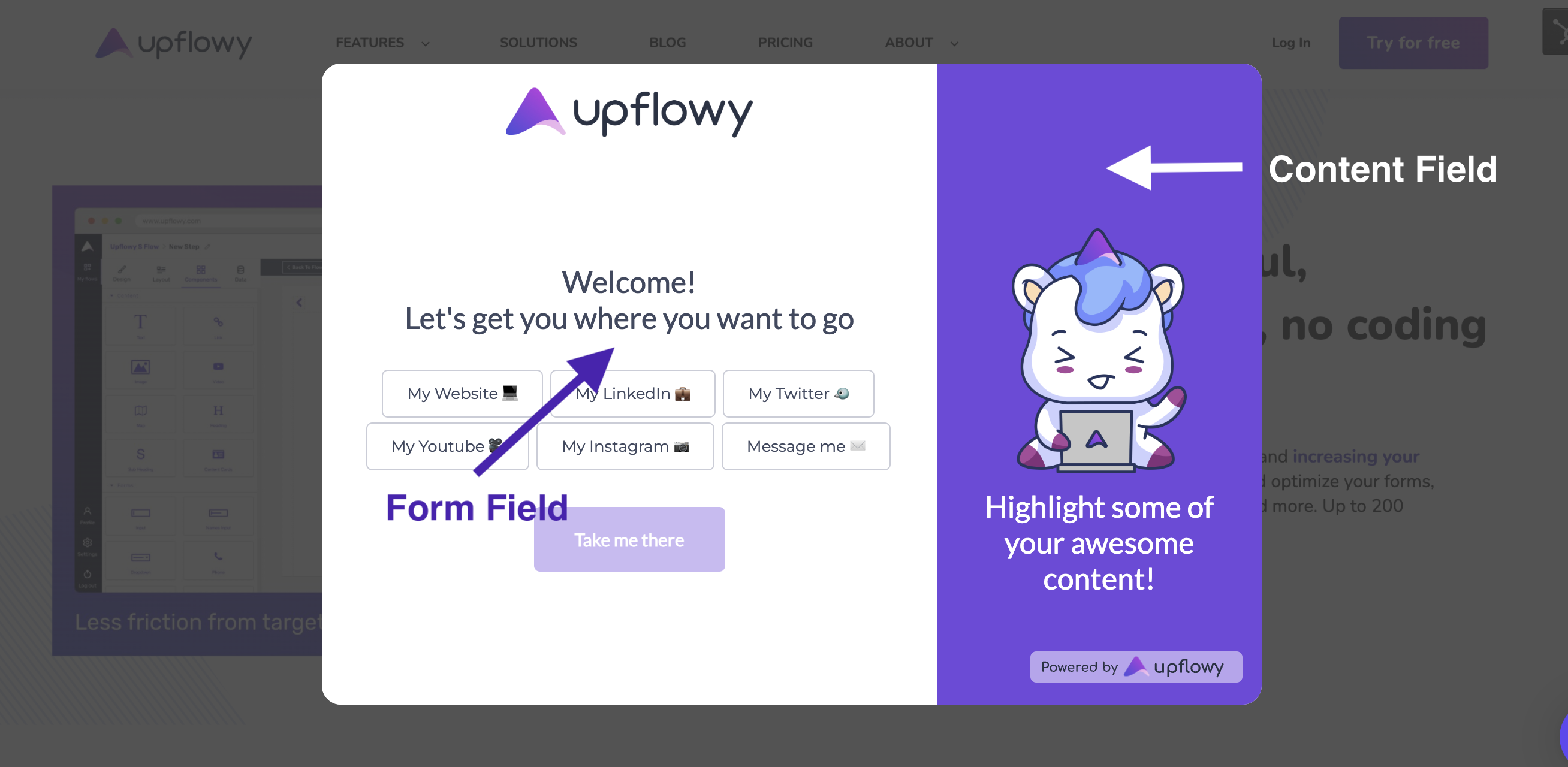
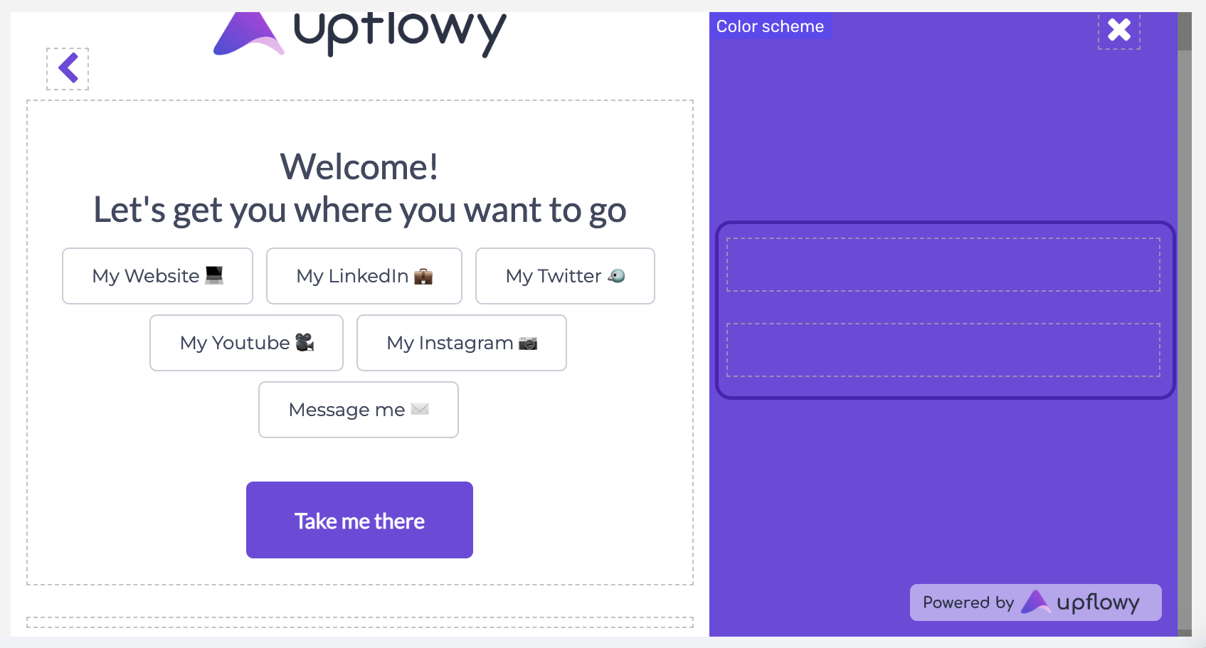
Form and Content Fields
Besides choosing between modal and full-screen modes, you can also decide whether you would like to have a content field on your flow, or you would like to have the form only.
At Upflowy, we call the main part of the flow the form field. This is the space where you can add:
- input fields
- text fields
- images, videos, and other content, like the map
The form field will always appear, both in desktop and mobile views.
The content field, on the other hand, is an optional part of the flow that you can fill up with contextual components. You can add:
- images, videos, and other content, like the map
- text fields
The content field is best used for storytelling and to enhance the design, however, it cannot contain input fields.
In desktop view, the field will appear on the right side of the flow, and in mobile, on top. However, if the screen is too small, the field gets hidden.
The Content Field in mobile view
While the input field is always visible in both desktop and mobile views, that is not the same for the content field.
In the editor, this field contains two content blocks where you can drag components, one upper one, and one a bit below:
The top block is designed to appear in both desktop and mobile views - while the bottom one will only appear on desktop, due to the smaller screen size of mobile devices.
If you would like the content to appear in both views, make sure to add your content on the top - however, if it is for desktop viewers only, you can use the bottom block.
Here is a short video of how the same content would look in different views. In this demo, the text is added to the top, while the unicorn is part of the block at the bottom: