How to optimize your Upflowy experience for mobile
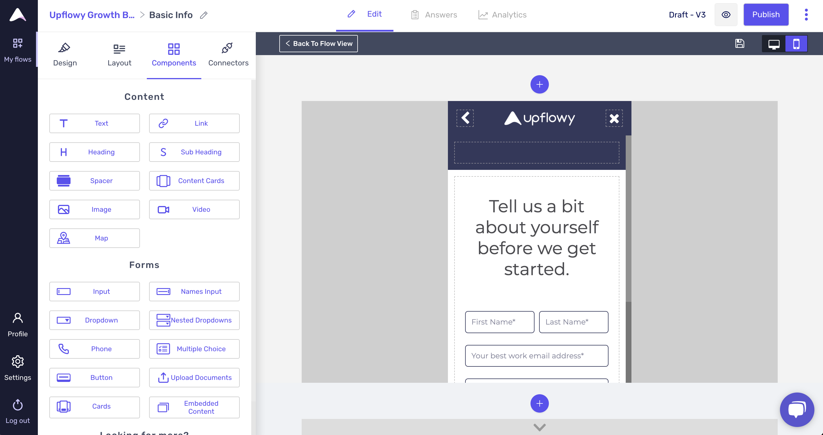
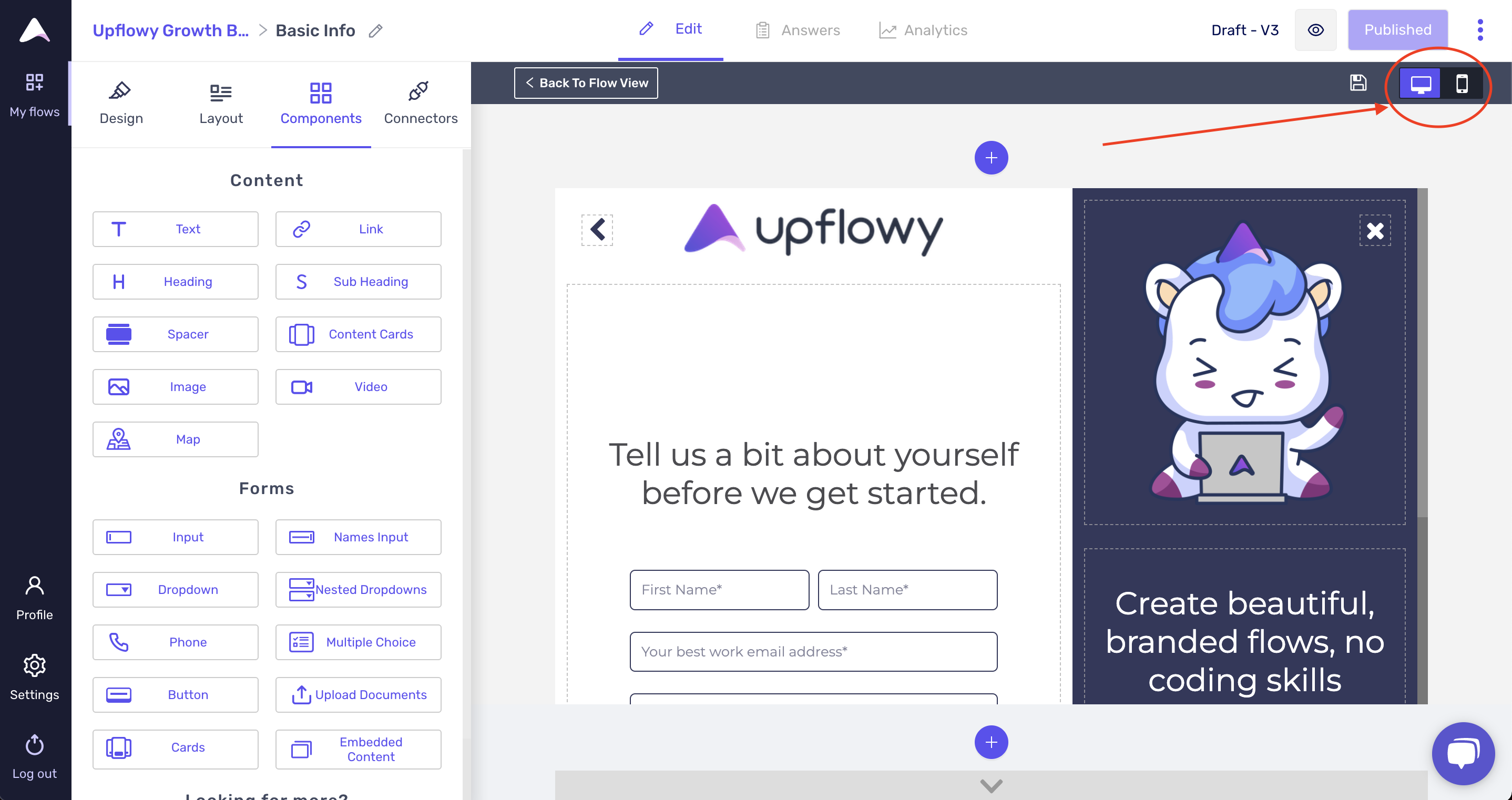
In Upflowy, you can toggle from desktop to mobile view in the step editor to see what your experience will look like in both formats:
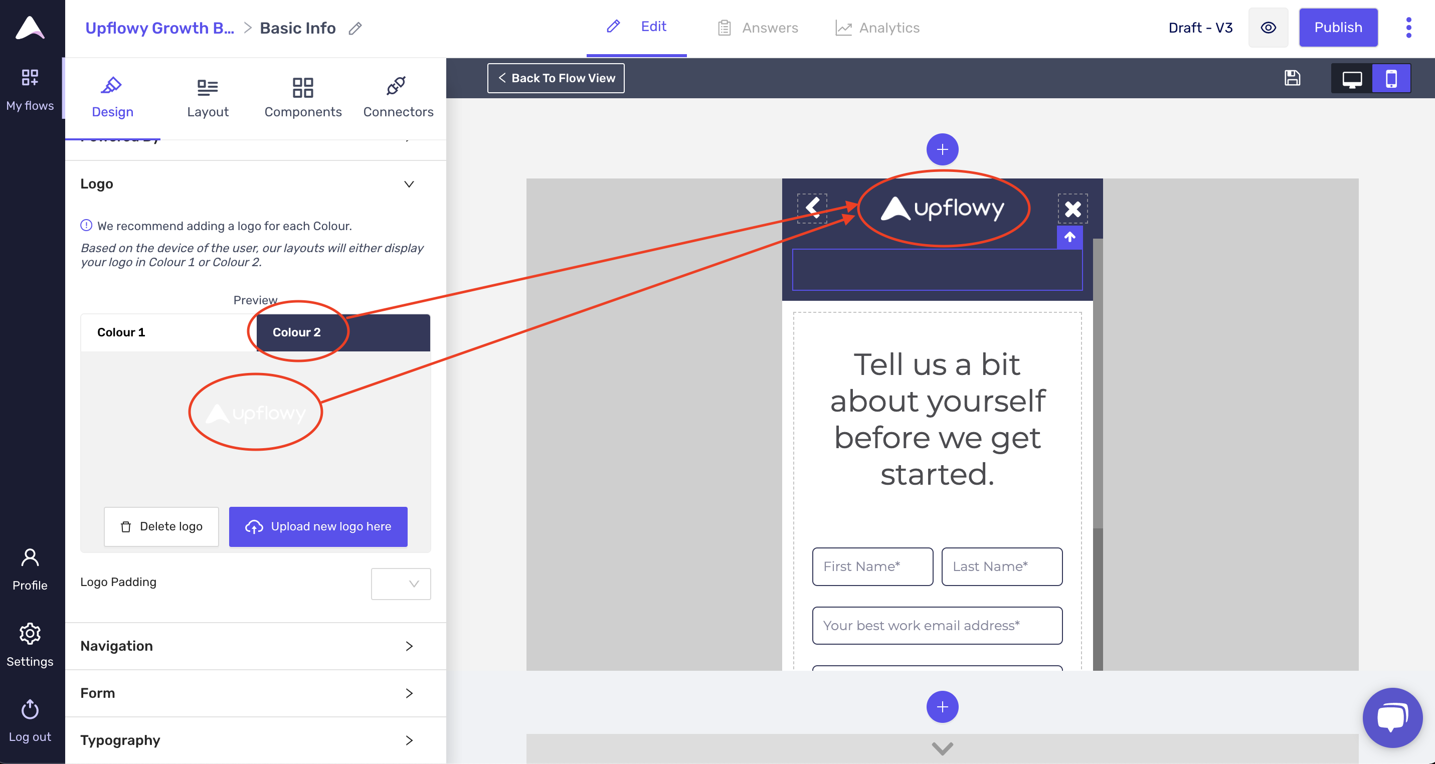
1. Make sure you Upload 2 logos: one for desktop and one for mobile
In the Design Tab, under Logo's you'll have an option to upload a "Colour 1" logo and a "Colour 2" logo.
Uploading a logo in "Colour 1" will bring it up to the desktop experience:
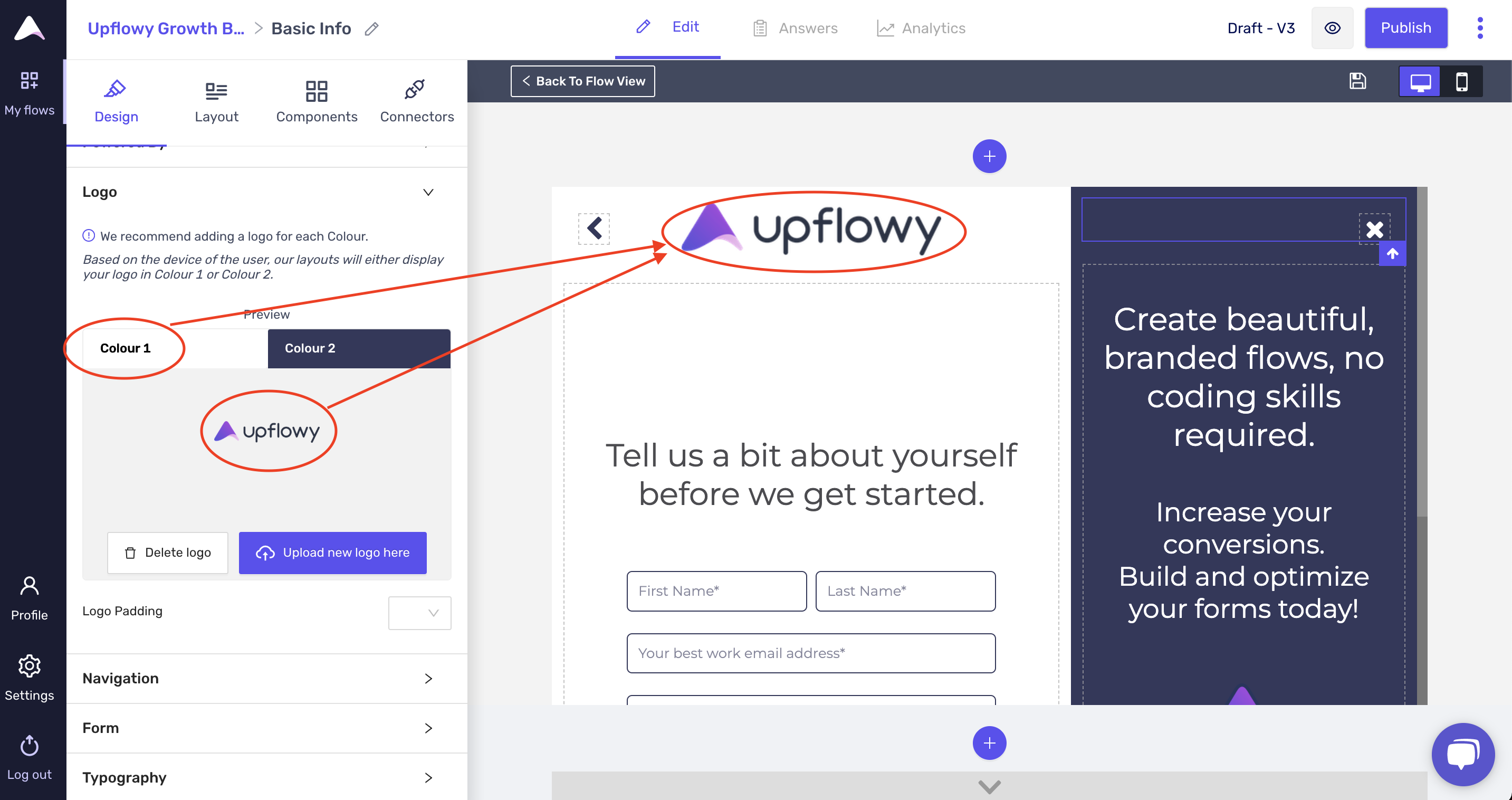
Uploading a logo in Colour 2 will show it in mobile experiences:
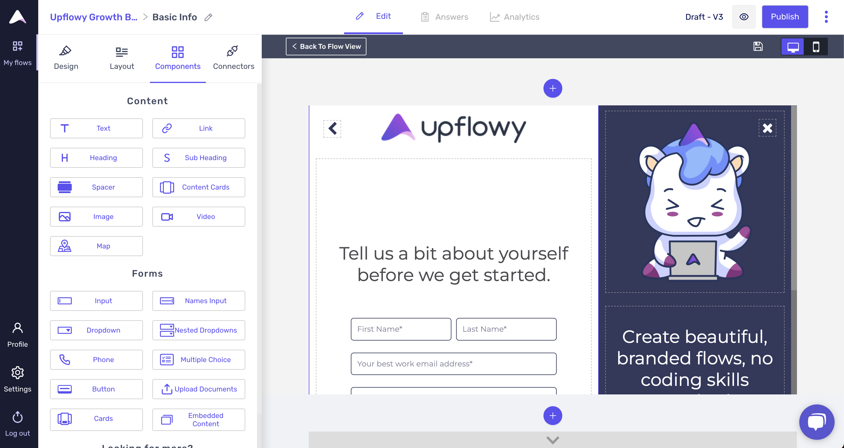
2. Show content in desktop, but not mobile views:
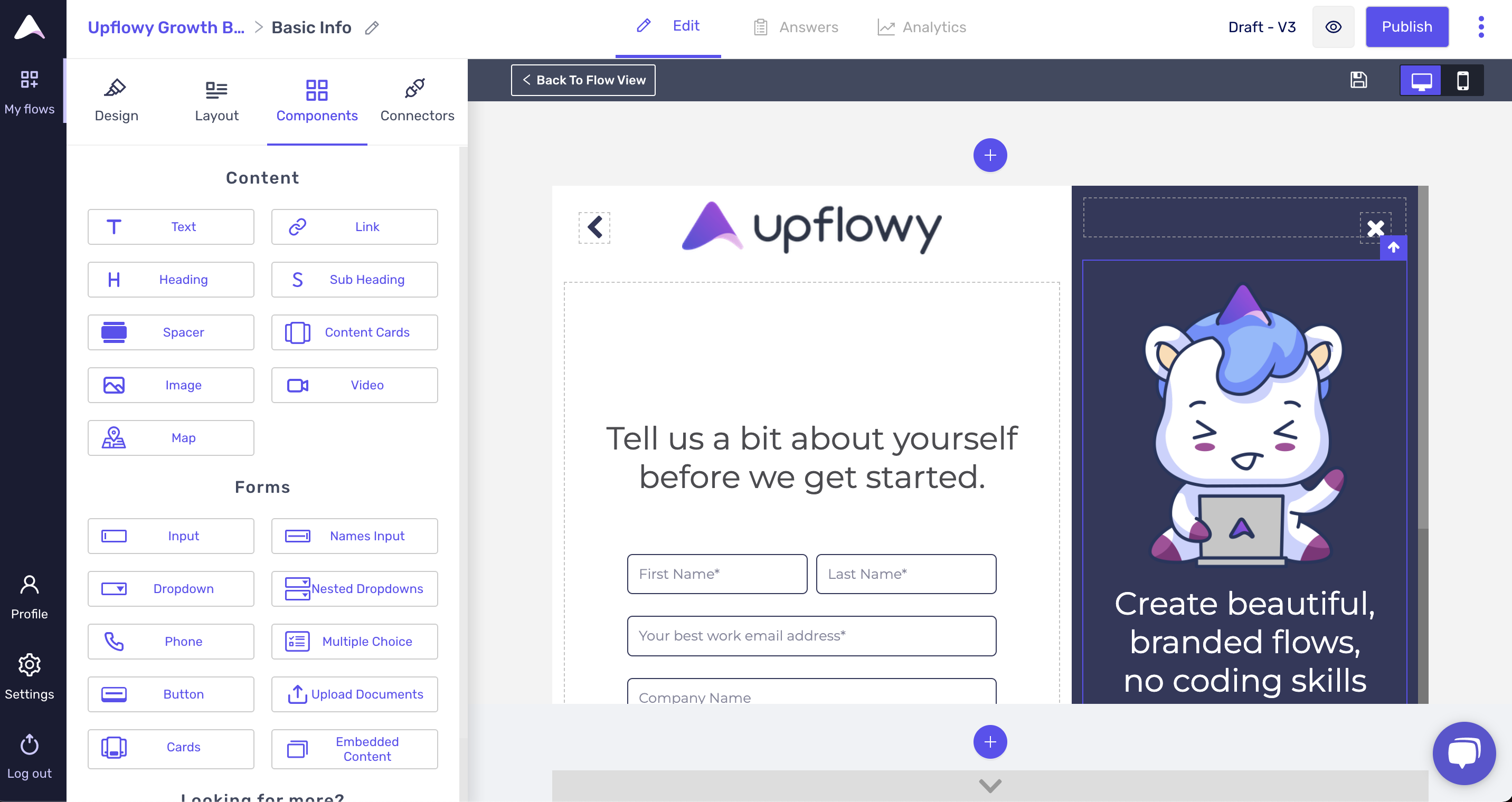
The content block to the right-hand side has two blocks that you can drop content into - the top and the bottom blocks. Desktop views allow for more content due to the extra space, but mobile views are best made simple!
Anything added in the top block will be seen on mobile. Anything added in the bottom block will be seen only on desktop.
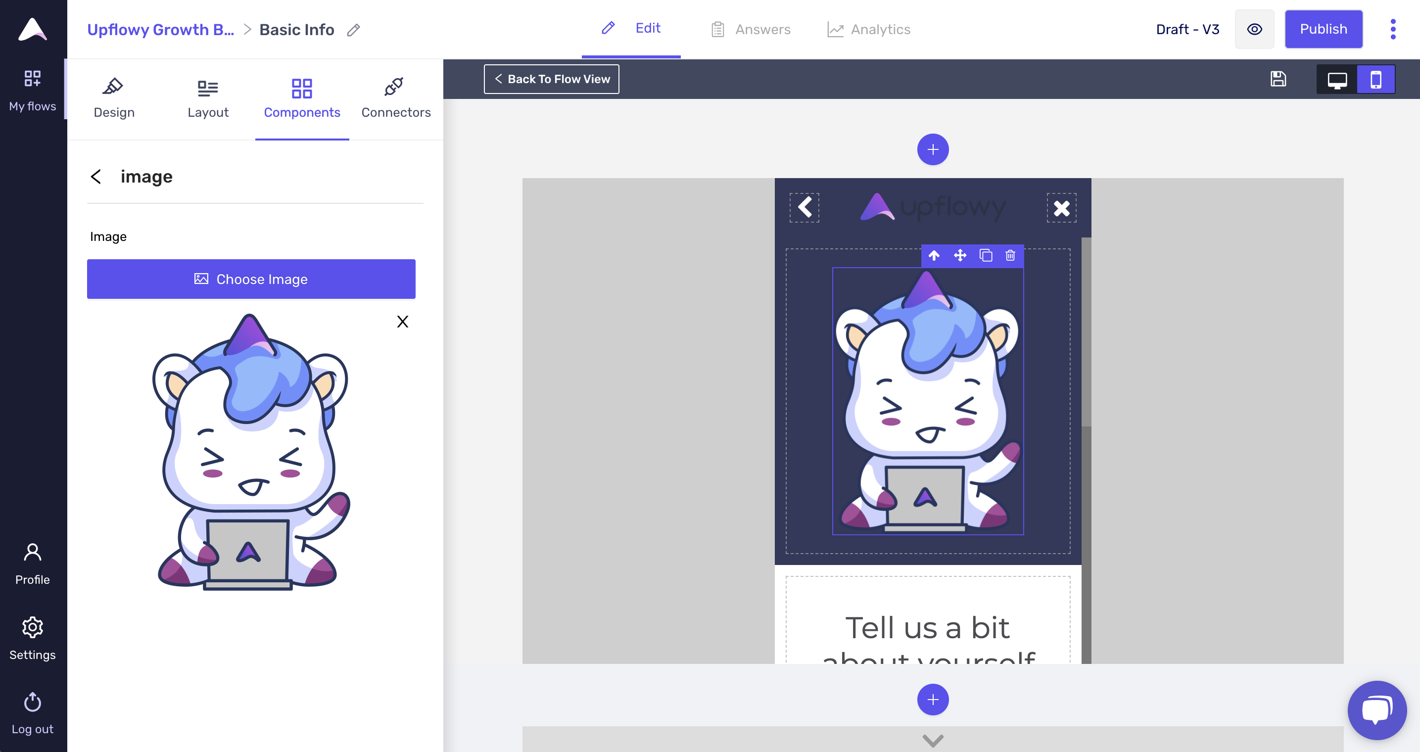
Currently, I have an image in the top block and text in the bottom block. If I click on mobile view, I'll see that my image takes up too much space on mobile:
However, if I move the image to the bottom block, I'll no longer see any content in the mobile view: