
How to customize your flow with custom CSS
This section is for users with CSS experience. If you encounter any challenges, please refer to the CSS documentation.
You can easily select any element within a flow by using its CSS class name.
The HTML structure of a flow
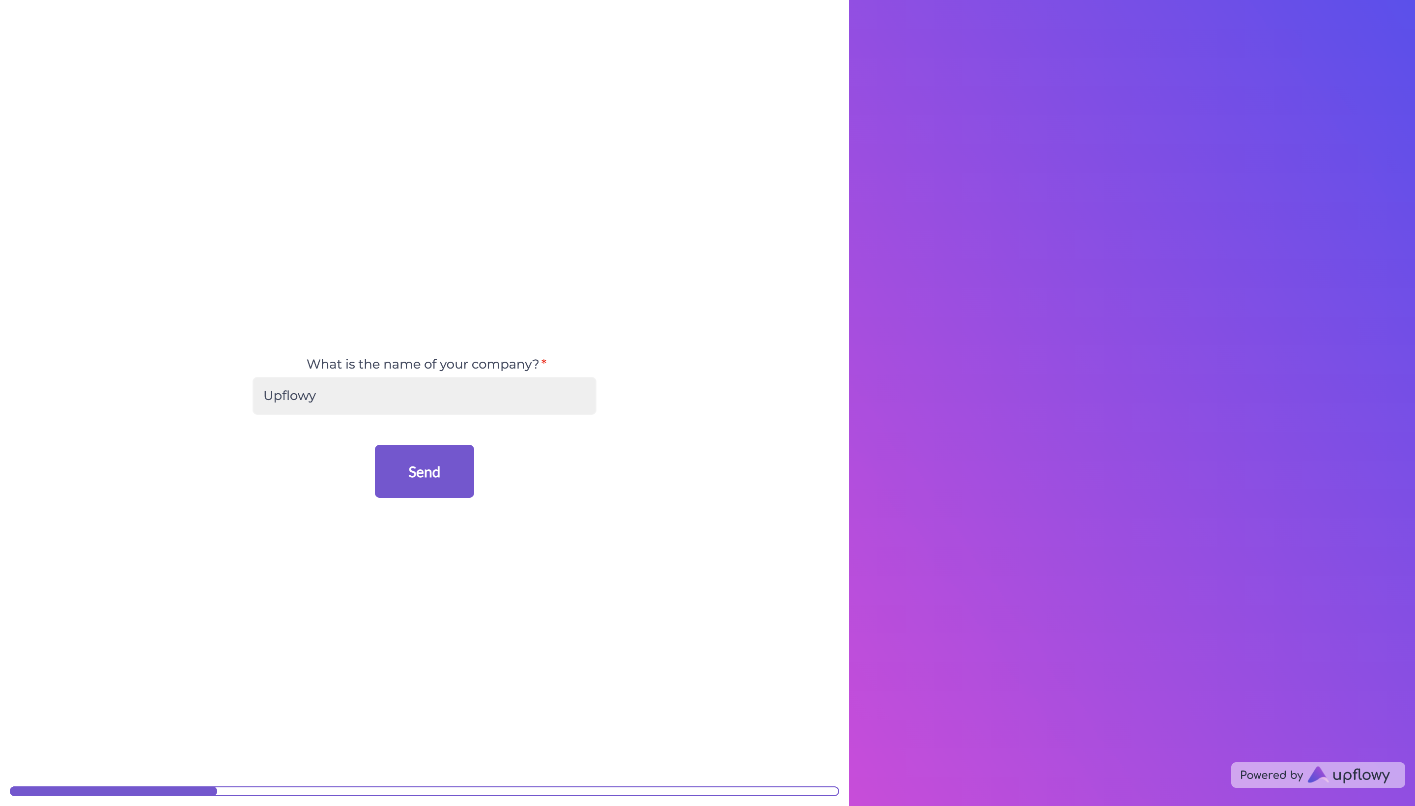
Light and dark containers (colour blocks)
Each step displays 2 containers: one with a light colour (the left one on desktop/bottom one on mobile), and one with a dark colour (the right one on desktop/top one on mobile).
- To target the light container:
.light {
	...
}
- To target the dark container:
.dark {
	...
}
Form container
Every draggable component in the light container is part of an HTML form container, that can be targeted with the following class:
.UP_formContainer {
	...
}
Submit button
- For a button with primary style:
.button.primary.submit {
	...
}
- For a button with secondary style:
.button.secondary.submit {
	...
}
Progress bar
- For the filled part of the progress bar:
.light > .UP_progressBarContainer > .meter > .progress {
	...
}
- For the empty part of the progress bar:
.light > .UP_progressBarContainer > .meter > .empty-progress {
	...
}
Logo
.UP_logoContainer {
	...
}
How to select the draggable components
Text
form > .text-component {
	...
}
Link
form > a {
	...
}
Heading
form > h1 {
	...
}
Sub Heading
form > h2 {
	...
}
Spacer
.spacer {
	...
}
Content Cards
.content-cards {
	...
}
Image
form > img {
	...
}
Input
.form-input {
	...
}
Names Input
.form-names-input {
	...
}
Dropdown
.form-select {
	...
}
Nested Dropdowns
.nested-form-select {
	...
}
Phone
.form-phone {
	...
}
Multiple Choice
.multi-select-wrapper {
	...
}
Upload Documents
.file-uploader {
	...
}
Cards
.card-group {
	...
}
Chargebee Checkout
.button.primary.chargebee-button {
	...
}
Our library of custom CSS components
Gradient button
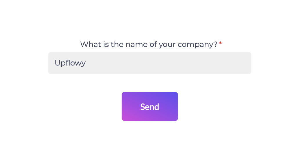
.button.primary.submit {
    background-image: linear-gradient(to bottom right, rgb(217, 58, 224), rgb(96, 72, 243));
    border: 0;
}
Easily customize your colours by simply adjusting the RGB values or inputting the desired colour hexcode.
Larger button
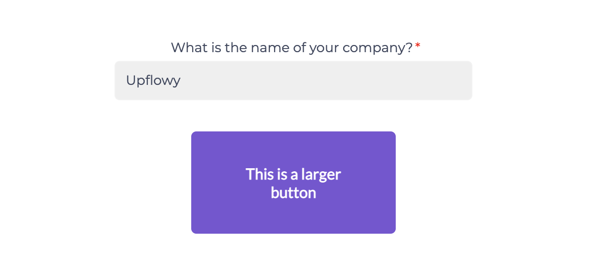
.button.primary.submit {
    width: 200px;
    height: 100px;
}
Gradient right-hand colour block
.dark {
    background-image: linear-gradient(to bottom right, rgb(217, 58, 224), rgb(96, 72, 243));
}
Gradient progress bar

.progress {
    background-image: linear-gradient(to bottom right, rgb(217, 58, 224), rgb(96, 72, 243));
}
Square edge progress bar

.meter > .progress, .meter > .empty-progress {
    border-radius: 0;
}